Lucid Dreams of Kwan Shan Mei
Lucid Dreams of Kwan Shan Mei
Written by Oscar Ng
Prelude
The opportunity of inspecting Madam Kwan’s work close up was not only rare but instantly gratifying. I was given this privilege to help her estate sort and tidy up the bulk of art materials in December 2017. At first glance, it was just stashes of newspaper cuttings in rusty paperclips, dusty folders in different configurations, cramped with loose papers and a pungent, musky smell. There were also rolls of large papers, and bundles of odd cardboard parcels that were bursting out from hastily packed with masking tapes with dull strings. Yet, this mess raised an odd sense of excitement which I suppose only artists and treasure hunters can relate. Credit must be given to the Toh sisters Wendy and Linda, who in their best capacity, sieved through the late Madam Kwan’s household in Canada before vacating, and how tedious it must be for them to make difficult decisions to forsake and choose what to bring home within their limited means in 2013.
The sorting process spanned a few sessions and the entire collection was revealed and re-indexed into individual pockets. We were able to sort out the contents to the following categories:
- Letters (legal contracts, correspondence, personal letters, awards)
- Newspaper cuttings of KSM work, many were not dated
- Folders of smaller illustrations and sketches
- Book collection of her titles and others
- Small size artworks
- Large size artworks
- Rare doll which is over 30 years old
All the art works were placed into portfolios to protect them, and all the paperwork filed into new folders for our referencing before archiving them into more permanent placement.
Fundamentals of Illustration
Kwan has a strong work ethic, always insisting to understand the text and character thoroughly before putting down the first line. She firmly believed that research is vital for accuracy and felt that a story requires more study than a text book. The period of history, customs and status is important as they influence the culture, costumes and mannerism to be depicted. Facial expression between a master and servant differs from those of parent and child. The lack of planning would mean massive correction later.
Going through the text in-depth enables Kwan to capture and distil the essential spirit of the characters and their atmosphere. She created characters by referencing and believed that exaggeration of human and animals was necessary. She would also select the right medium and treatment to best present a lively illustration. (Cited from Madam Kwan’s workshop report Technique in Illustration, during the Training Seminar on Book Design and Illustration from 29 Aug till 2 Sep, 1980 at the Marine Parade Branch Library, organised by the Singapore Book Council.)
The sorting also allows me to closely examine Kwan’s beautiful artworks. Her skilful use of techniques can be observed not only through the Moongate series, where each book was presented in unique style and techniques, but also her illustrations commissioned for textbooks, magazines and newspapers. Every original illustration deserves to be savoured at length, as Kwan loves to use mixed media effect and techniques to present her work.
I hope to share my interpretations of some of my favourite works with you.
Malay Dancers
Casein on paper, date unknown
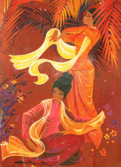
Coming from China and Hong Kong, Kwan has always been fascinated by Malay culture. Through her first feature film Blood-soaked Valley (1957), she depicted beautiful ladies in their sarong kebayas singing and dancing in the kampung. Kwan used “S” shapes on the scarves to compose the positions of the two dancers, which offer the viewers an abundance of aesthetical trails to stay within the subjects. Notice the accurate foreshortening of the arms of the standing dancer, with both dancer’s hands and graceful dance gestures depicted in authentic, traditional style.
What is interesting about this illustration is the heavy use of casein paint. Before acrylic paint, casein paint was popularly used by designers and illustrators for its fast-drying effect and flat matted surface. In this illustration, Kwan used both bold and thin linework with no trace of pencil guide. It is possible that she drew this without sketching (some corrections can be spotted – the patch on the bottom right side of the kneeling dancer; top left near the scarf of standing dancer).
The two layers of palm leaves reflect Kwan’s commendable skills in creating depth, while one of the foreground palm casually covers the blemish on the face. It shows her confident skills and swiftness in creating this artwork.
Let's go to School
Gouache on paper, date unknown
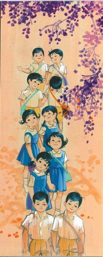
This beautiful illustration was drawn on a small piece of cartridge paper, lightly washed over with diluted peach hue on a downward stroke that can be easily mistaken for a vanguard sheet. The downward strokes of the highlights on the children’s sleeves and light shadows of the tree on the floor suggested rays of light piercing through the tree, and one could tell it is morning instead of after class.
Almost all the children’s hair was given slight curves to show the vitality of childlike cuteness. The hair highlights in bluish tones was Kwan’s signature style. Her fine details as such were often overlooked – the front of head received more light than the back, and when described consistently, the illustration provides a convincing natural light source.
On closer observation, the under chins, arms and even the kneecaps were given a wash of shadows to give the skirts and pants more volume. Yet perhaps in a rush, Kwan overlooked two arms of the girls that required some shadows. Kwan has also at times preferred pencil marks as the soft lines presented its subjects more naturally. Any ink trace would be too harsh for the overall effect.
Taro and his Grandmother
Watercolour and ink, 1976
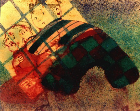
This illustration was drawn in the 70s, when ‘Photoshop’ did not exist. This illustration is amazing because by using only watercolour and ink, Kwan’s skilful techniques created a cinematic effect. The contrasting window and shadow effect was boldly created by simply scrapping paints off toothbrush with a comb, and by using stencils and spray technique. Novice illustrators would not be able to confidently pull of this spraying technique. Note the main colours – red, blue, green, and purple— were harmoniously blended, leaving the top window as a focal point.
Kwan used wet-on-wet watercolour technique for Taro’s pants and his grandmother’s clothes. Taro’s top and pants were painted in bold lines and large square patterns to add variety to the fabric. Technical ink pen was used to draw the faces of Taro and Grandma. The hands were gently faded using pointillist technique instead on linear lines, so as to not distract the overall presentation.
The composition of this illustration tells a whole story in a single frame. Taro is looking behind him while shielding Grandma, who looks at Taro while holding her chest. Both their faces were cast in the light from the window, though they were in a dark place. This gives the viewer a sense of hope and suspense, and makes them root for the heroic, protective Taro.
The Malay Wedding
Mixed Media, date unknown
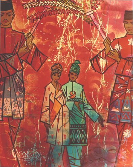
On a first impression, this image looks like a batik print with a lot of textures. Kwan dabbed natural cotton fibre strands with paint and transferred the light horizontal grey and ochre lines to create batik resist effect. White vertical lines were created using the same method.
Clusters of paint spots on the bottom and above the couple formed bursts of celebrative mood, using masking fluid to create the effect technique. Bold lines and patterns were found on the dressing of the two attendants holding the ‘Bunga Manggar’ to create a variety of designs, thus giving each character individualistic personalities. The patterns of the sarongs were also masked with design and painted over.
The clever cropped positioning of the two attendants gives the centre placement of the couple focal attention. The foreground and background perspectives also suggest movement. Stencils of classic Javanese motifs (J-curves) were used in the overall ambience to suggest festive moods. Similar motifs also appeared in her other illustrations.
Other than the faces and the slight curves of the lady’s hands, all the lines were straight, bold and angular, providing a harmonious balance between masculine lines and feminine colours that contrasts, yet complements. We often see this delicate, delightful balance in Kwan’s other works.
Note the Surakarta-style kris (dagger) carried by the groom, and the pattern on various headwear. Such details show how meticulously Kwan did her research before illustrating.
Chinese New Year
Gouache on paper, 1986
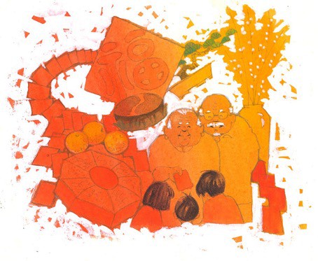
There are 4 main colours used in this amazing illustration: red, orange, white and black. The hint of green on the bonsai was added as a complementary colour against the red, after Kwan sent the illustration for print as it lacked contrast. This was described on her short scribbles in the artwork after colour separation. The gradient wash was done on a cartridge paper using red and orange. However, Kwan enhanced the visual appeal by adding a spot of red in the orange (bottom right side) and a hint of orange among the red hue (on the three fruits).
The white gouache was generously painted along the sides, while leaving hints and gaps, as if they were firework fragments. Pencil markings were precisely drawn, and all seems to be in order, except for the deliberate red packet overlap on the left, and the vase line on the right stroked into the red packet.
Seven auspicious New Year elements were used in the illustration – red packet, snack box, nian-gao (glutinous cake), oranges, calligraphy, pussy willows, and a bonsai tree. This shows her compositional finesse in considering the placement of all these elements within a 5-inch square.
The look of the elderly couple is amiable, and the intense spots of white used on their hair and brows helped to focus the viewer’s gaze towards them.
Oscar Ng is the Head of Alumni Relations, Nanyang Academy of Fine Arts.
Images source: Estate of Kwan Shan Mei
Next essay:
The Private Kwan Shan Mei