Reading Spaces: How Illustrators depict space in three Philippine children’s books
by Rommel E. Joson
Once typeset, illustrated, printed, and bound, the story becomes a physical thing. As an object, it takes on new rhythms. The story may have been formed by the rhythm of words and sentences, but the addition of typography and illustration on the printed page, creates the rhythm of the page turn; the reader hangs with anticipation on the promise of one spread, to be caught in surprise or wonder with the reveal of the next.
The form and structure of the story fill the space of the book. This space is the illustrator’s playground. The following analysis and discussion hope to shed greater light on how the illustrator participates as a co-creator in depicting a story’s narrative and emotional reality. In a picturebook or an illustrated children’s book, we are looking at two levels of space. On one level is the physical space of the printed page, which considers the size of the letters; the length and shape of the words; and the appropriateness of the images which are bound by the limitations of page count and trim size. And on another level is the narrative and pictorial space of the story; this is the space where characters interact, and where the action unfolds in terms of both place and time. A writer crafts this space by developing setting; an illustrator represents the setting—whether through paint, pencil, or pixels—by making stylistic decisions on how to translate narrative space onto the flat surface of the book.
In picturebooks, space can be depicted in three ways: (a) through linear perspective, (b) atmospheric perspective, and (c) hierarchical perspective. A book need not be limited to a single method; sometimes, illustrators may employ varying styles and spatial techniques within a single book to convey a particular emotion or reality.
The choices an illustrator makes on how to represent space should never be arbitrary, nor purely decorative. One must be aware that these stylistic decisions are charged with narrative and conceptual meaning. And as the following examples will show, the choice of perspective carries both pictorial and emotional functions and associations. In making these images, an illustrator acknowledges the limitations of the flat surface of the book and must create and recreate the world for the viewer and the reader. According to Rudolph Arnheim, “the artist realises that he cannot simply rely on what the viewer knows about the physical world. Such knowledge must always be restated with visual means in order to artistically effective, and it is easily undercut by perceptual counterevidence (248).

Use of Linear Perspective in 'Doll Eyes'
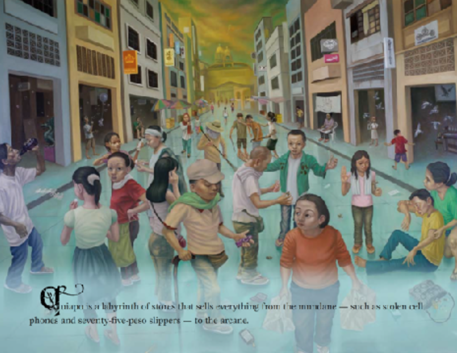
Linear perspective is a systematic method of achieving depth and illusionism through the use of lines converging toward an imaginary point along a horizon line. This is the space of Giotto and the High Renaissance; it is a way of rendering illusionary spaces that one can almost enter and inhabit. In the book Doll Eyes, the illustrator uses linear perspective to recreate a real place in the Philippines and imbue the book with almost three-dimensional weight and and volume.
Written by Eline Santos and illustrated by Joy Mallari, the book was one of six awardees for Best Reads in the 2nd National Children’s Book Awards of 2011. It is set in the historic Quiapo district in Manila, site of the famed Plaza Miranda and the Minor Basilica and National Shrine of Jesus Nazareno, more commonly known as the Quiapo Church.
On this site, Catholic devotees numbering in the thousands jostle and press against one another to celebrate the Feast of the Black Nazarene where the image of Jesus Christ as the Black Nazarene is borne by devotees along the neighbouring streets of the district.

Quiapo is a place where the sacred and profane stand cheek by jowl; this is where the practice of Catholic ritual and dogma is juxtaposed against the day-to-day reality of fortune tellers plying their trade, and stalls selling supposed magical amulets and bottles of folk medicine. Here, passers-by are always cautioned against potential thieves and pickpockets.
As a supernatural horror story, Doll Eyes is a rarity among Philippine children’s books. The story is about Tin and her best friend Ella; both of whom are sampaguita vendors. One day, Ella is lured and captured by a mysterious old woman named Manang Bolabola and trapped in her doll shop. Over the centuries, the woman has been kidnapping children and turning them into dolls, eventually harvesting their eyes for her benefit. One night, a premonition strikes Tin and she searches for her missing friend. She eventually finds Manang Bolabola’s lair, defeating the old woman and freeing her friend through the help of a “tall dark fellow”—no doubt alluding to Jesus Christ as the Black Nazarene.

Published by in 2010 by CANVAS (Center for Art, New Ventures and Sustainable Development), the production of the book follows a process unique to the organisation and atypical compared to other children’s books published in the Philippines.
Aside from producing children’s books as part of their reading advocacy, CANVAS is also an established art gallery. The process begins with a story writing competition that invites writers to craft a children’s story inspired by a painting or sculpture chosen by CANVAS. The artist participates in choosing the winning story from a shortlist of submissions. Then the creates a series of artworks based on the winning manuscript. The artworks have the added purpose of functioning as pieces for a gallery exhibition.

The illustrations for Doll Eyes were made by Joy Mallari (b. 1966), an artist more commonly associated with Philippine contemporary painting. In her formative years as an artist, she worked in the Philippine animation industry and was part of the artist collective known as Grupong Salingpusa. Mallari’s artworks for the book were rendered with oil paint on large mounted canvasses, some measuring as small as 26 x 30 inches (60.4 x 76.2 cm) while the largest measures 72 x 108 inches (182.88 x 274.32 cm) —sizes that are well beyond the normal trim size of a printed book.
The paintings depict Quiapo as a living place populated by all sorts of characters. The backgrounds are presented in an illusionistic way, using linear perspective to create a very familiar view of historic Plaza Miranda that stands at the very heart of Quiapo. The book is a tableau of objects, people, and textures. Manang Bolabola’s doll shop is decorated with wallpaper patterns of a sinister winged creature; stuffed toys cram inside wooden shelves; wrinkled fleshy hands clutch crumpled peso bills; litter lies uncollected on the pavement, and the large shiny eyes of various characters reflect unseen light sources.
It has been said that maximalism characterises Philippine spaces. Many Filipino homes feature mementoes collected and hoarded over the years. These same homes often allow their private spaces to spill onto the very public space of the streets during late night videoke party sessions. Doll Eyes taps into this maximalist aesthetic. The story also suggests the tension between the secret hidden place of the villain’s lair and the very crowded public space of the Quiapo district.
There are many elements embedded in various spreads for readers to discover which are not explicitly written in the text. These details not only contribute to the atmosphere of the story but also foreshadow and echo the conflict within the book. The opening scene features a view of one of Quiapo’s nearby streets with shops lining both its sides.
The text provides a one sentence description of the place: “Quiapo is a labyrinth of stores that sells everything from the mundane—such as stolen cell phones and seventy-five peso slippers—to the arcane.” The illustrations fill in the details left unsaid in the text: a trio of what appear to be blind people leading each other; arcane talismans being bought and sold in the open; a man chugging a bottle of beer in the middle of the day; a faith-healing session by a girl in iconic pose of the Santo Niño; and sinister elements in the background contrasting with whimsical details. There is a leitmotif of bubbles and orbs throughout this book as well as little paper dolls strewn in the street—a hint of how the villain collects children, turns them into dolls, and harvests their eyes.

One distinct aspect of Mallari’s illustrations is the gaze of the characters. In multiple images, characters gaze directly at the reader almost conversing and at times challenging. Images like these, where the subject’s gaze holds the viewer are called “demand images” because they demand the viewer into entering into some kind of imaginary relationship or interaction (Kress and Van Leuwenn 118). Mallari’s use of perspective and eye-level places the reader squarely within the scene as if a participant in the story, often having the main character looking at a reader from beyond the page.
David Lewis, in his discussion on demand images, notes that many picturebooks that tell straightforward stories avoid demand images. To him, “the moment that a participant turns to face the reader then the narrative spell is broken and the boundary separating (imaginary) characters from (real) readers is breached” (Lewis 157). But Doll Eyes, continuously creates demand images in various spreads, as if daring us to be part of the ongoing story.
As mentioned earlier, perspective has both a pictorial and emotional functions in the narrative. The use of linear perspective, recreates Quiapo as a real place for the reader. It situates the story in a place of both the mundane and the arcane, imbuing the story with various cultural associations. With its use of eye-level placement and gaze, it attempts to pull the reader into the story. Its detailed volumetric illustrations also give it added emotional weight.

Atmospheric Perspective in 'Paboritong Lugar ni Nanay'
Atmospheric perspective characterises the illustrated spaces in Paboritong Lugar ni Nanay (Nanay’s Favorite Place). Atmospheric perspective creates depth through the modulation of tonal values and color. This simulates the effect of atmospheric disturbance on objects and forms seen from a distance. This type of perspective can often be seen in Chinese watercolour paintings of landscapes and mountains. It is also often used to create a feeling of distance between forms in the background.
Written by Weng Cahiles and illustrated by Aldy Aguirre, the book was published in 2020 by Adarna House in partnership with Room to Read, a global non-profit organisation that advocates reading and literacy among low income communities. The process of this book’s development—although it began as a written manuscript—is also atypical of the usual publishing process. The book was developed through the mentorship of a group organised by Room to Read and in partnership with several Philippine children’s book publishers. The process placed significant emphasis on the role of the illustrations to carry the narrative; thus words, sentences, and whole passages that were deemed unnecessary were pared down.

This created books for children that had significantly limited word counts (compared to most Philippine children’s books), and relied on the illustrations to do much of the storytelling.
Aldy Aguirre (b. 1982), an award-winning illustrator who has been recognised in both the Philippines and abroad works almost exclusively in watercolour. His illustrations are replete with shapes of soft edges and delicate color blooms that co-exist with characters that almost float in colour washed landscapes. In Paboritong Lugar ni Nanay, he uses his penchant for delicate landscapes and fat blooming clouds of washes to illustrate a book about a special kind of place.

The story is about a boy and his mother’s recollection of her favourite place. She describes this place through tangible experiences: the grass nipping at her heel; flying paper airplanes on strings; catching insects by the hand; resting under giant trees; and returning home by the light of fireflies. But this favourite place is a lost Eden; the path towards it has long been forgotten (she cannot remember the way). Despite this, the story ends with a promise to find one’s personal paradise:
Makakahanap din kami ng lugar
na magiging paborito niya
at paborito ko.
(We will one day find a place that will be her favourite and mine too.)
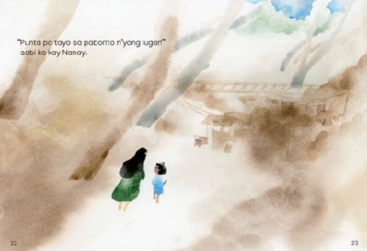
There is an amorphous quality in Aguirre’s work; shapes defined by colour juxtapose against one another even as their edges bleed into each other. The spreads have no defined horizon line; images are set in an almost void-like setting with tinted washes. Sometimes, spots of colour create the merest suggestion of place: a pale wash of yellow for the sky, or a patch of green applied wet-on-wet for the ground and grass.
Sometimes as the main characters converse, their bodies flow into clouds of recollection where ghost-like images coalesce and hang in the air. These wet-on-wet washes and blooms are offset by the wet-on-dry application of delicate strokes, such as thread-like tendrils for the veins of leaves, or the intricate wings of insects. In the end, as the reader realises that this Eden is a distant memory, the dreamy idyllic images of the Mother’s favourite place give way to grainy brown swatches of shanties at a distance.

Aguirre’s use of watercolour and atmospheric perspective is both a stylistic choice and a conceptual one. The Mother’s favourite place is a memory that lives only in the heart, tinted and made hazy by time, just like the illustrations’ soft and dreamy atmospheric quality.
What the images hope to convey is not the representation of a literal and tangible space but a deeply personal space and reality. The choices made in the illustration do not attempt to create illusionistic and specific forms; instead they suggest and create associations. It invites the reader to fill in their own versions of this favourite place.

Hierarchical Perspective in 'Sayaw ng mga Kamay' (Dancing Hands)
Sayaw ng mga Kamay relies off a hierarchical perspective in representing the narrative space of the story. Hierarchical perspective is a method of depicting images that does not rely on objective perception but on the relative importance of elements within a composition based on a subjective or symbolic criteria.
According to Daniel Sofron, this is the kind of perspective used in Egyptian Art, Medieval Art of the Byzantine Period, as well as naive paintings and children’s drawings (Sofron 254–256). Perception takes a back seat to the weight and importance of a character or individual within a setting or social context; thus important characters within a composition can be exaggeratedly larger than less important individuals or even buildings and physical structures.
Written by Joanna Que and Charissa Marquez and illustrated by Fran Alvarez, the book shows the blossoming friendship between two girls through Filipino Sign Language (FSL). The protagonist, a girl named Sam, becomes curious about her new neighbours’ “dancing hands”. She observes how a father and his daughter converse only through facial expressions and sign language. The daughter’s name is Mai; she is deaf and can only communicate by signing. A chance meeting between Sam and Mai gradually leads to more planned playtime.
But sometimes, they find it difficult to understand each other, until Mai teaches Sam how to make her hands “dance”. In learning how to sign, both children are able to describe and understand the world around them, and to communicate their hopes and dreams to one another. In the end, they express through sign language what they are to each other: the best of friends.
The first edition of the title was published by Adarna House in the Philippines in 2020. A second edition featuring modified illustrations was published in 2023 by Chronicle Books in the United States and Adarna House in the Philippines. The project was also a product of the Room to Read mentorship program; as such the collaboration once again involved a more synergistic relationship between publisher, writer, and illustrator. The usual process in the Philippine children’s book industry is primarily compartmentalised; the creative process is solely mediated by the publisher.
In this production pipeline, the illustrator will receive a completed manuscript from the publisher and will normally communicate only with them. The process involves stages of approval for character studies, sketches, storyboards, and then final rendered book spreads. As with Paboritong Lugar ni Nanay, Sayaw ng mga Kamay is the result of a more involved process that sees the illustrations taking a greater role in the telling of the story.
Since its publication, the US edition of the book was made a Schneider Family Book Award Honor Book and an Ezra Jack Keats Honor Book both in 2024. The illustrator, Fran Alvarez (b. 1988) has also been recognised both in the Philippines and in other countries, most notably as a finalist in the 2021 Bologna Children’s Book Fair, and a Green Island Awardee for her original work Fishing with Jin in the the 2023 Nami Concours. In Sayaw ng mga Kamay, she demonstrates the use of hierarchical perspective in communicating both setting and emotion.

Whereas Mallari’s illustrations define space through volume and form, and Aguirre uses predominantly soft-edged shapes of colour, Alvarez’s illustrations are all about line defining shape and space. This emphasis on line and the manipulation of scale of the characters based on their narrative importance within a scene define the illustrated space of Sayaw ng mga Kamay.
In multiple instances, the relationships of the characters are illustrated through their relative scale and position within the composition. For example, as Sam observes her neighbours signing to one another, she appears as a small figure peering through a window on the upper right hand corner of the spread, while father and daughter sit large and dominant in the foreground.
In the following scene, Alvarez depicts Sam and Mai’s unfamiliarity and initial emotional distance by placing each character on opposite sides of the spread; their positions are separated by the physical spine of the book. But as they grow to know each other, the children appear on the same side of the spread. Then, as their friendship blooms, both children become larger, occupying the same page. They appear to float, as the line that suggests the ground stops short of reaching their side of the spread; it’s almost as if the reader is entering further into the children’s subject reality.

From the initially restrained compositions of the first few spreads, the drawings become more playful; the characters sometimes bleed out of the edges of the page with the textured linework nearly occupying every available space. The book also possesses a restrained colour palette.
Most notably, the characters are rendered as line drawings using graphite and colored pencils. Although, modifications in the second edition used digital tools, the additional drawings remain consistent and seamless with the original pencil drawings. Alvarez’s use of line art noticeably creates a diagrammatic quality to the main characters’ hand gestures that allow the reader to register them with clarity.
The illustrations are made with textured and contour lines rather than volumetric rendering. Even colored passages are rendered by lines that show a deliberate intention to retain the visibility of the strokes. The use of the textured linework also calls to mind the authenticity and informality associated with drawing. In Emma Dexter’s essay “To Draw is to be Human”, drawing is seen as an act that has elemental connections to our past (6).

We use drawing to map places, dream through doodles, and make sense our surroundings; drawing is connected to time, place, space, and discovery (Dexter, 6–9). Drawing also has a natural kinship with handwriting as both involve putting a stylus to a surface and creating fluid, connected movements.
This calls to mind Paul Klee’s often quoted line in his Pedagogical Sketchbook, where drawing is seen as “an active line on a walk, moving freely, without a goal. A walk for a walk’s sake” (16). Seen through this framework, the use of line drawings in Sayaw ng mga Kamay, resonates with the story’s theme of communication and connection.
The illustrator’s role in depicting Pictorial and Emotional Spaces
The point that this discussion tries to make is that how an illustrator represents space goes beyond the purely pictorial or decorative; there are emotional and narrative implications to an illustrator’s aesthetic choices. How an illustrator decides to render characters and locations within a story, form part of a distinct visual grammar that flows and supports the aims of the written text.
As we have seen in the three examples, the stylistic decisions in conjunction with the text, create books that are greater than the sum of their parts. In Doll Eyes, linear perspective and volumetric rendering create illusionistic spaces that attempt to represent a real and particular place in the Philippines.
By being faithful to the actual place, the story is able to access various cultural associations that give it another level. In Paboritong Lugar ni Nanay, atmospheric perspective is used to convey an emotional and conceptual space that exists only in the hearts and minds of the characters. There is no attempt at creating realistic illusions, because the story acknowledges the subjective and deeply personal nature of a favourite place. While Sayaw ng mga Kamay, uses hierarchical perspective to describe the evolving relationship between its two main characters.
By using line drawings that suggest informality and authenticity, and by varying the scale, placement, and position of the characters, the illustrations also describe the emotional “dance” that happens between the closest friends.
This discussion hopes that by focusing attention on these aesthetic and non-verbal choices, those practicing the craft of children’s books can be even more deliberate in decisions that touch can both the mind and the heart.
References:
Aguirre, Aldy, illustrator. Paboritong Lugar ni Nanay. By Weng Cahiles, Adarna House, 2020.
Alvarez, Fran, illustrator. Sayaw ng mga Kamay. By Joanna Que and Charina Marquez, 2nd ed., Adarna House, 2023.
Arnheim, Rudolf. Art and Visual Perception. University of California Press, 1974. Burton, Johanna. Vitamin D: New Perspectives in Drawing. Phaidon, 2005.
Carrion, Ulises. “The New Art of Making Books.” Serraglia. www.serraglia.com/wp-content/uploads/ 2018/05/Ulises-Carrion-The-New-Art-of-Making-Books1.pdf
Dexter, Emma. “To Draw is to be Human.” Vitamin D: New Perspectives in Drawing, 2005.
Klee, Paul. Pedagogical Sketchbook. Translated by Sibyl Moholy–Nagy, Frederick A. Praeger, 1953.
Kress, Gunther, and Theo van Leeuwen. Reading Images: The Grammar of Visual Design, 2nd ed., Routledge, 2006.
Lewis, David. Reading Contemporary Picturebooks: Picturing Text. Routledge Falmer, 2001.
Mallari, Joy, illustrator. Doll Eyes. By Eline Santos, Canvas, 2010.
Sofron, Daniel. “The Hierarchical Perspective.” Anastasis: Research in Medieval Culture and Art, Vol. II, No. 1, May 2015, pp. 252–261, https://doaj.org/article/86e28c2aeceb491c8cb697202ea34235. Accessed 17 February 2024.

About the Author
Rommel E. Joson is a full-time lecturer at the University of the Philippines, and was formerly Art Director and Design Consultant for Lampara Publishing House, Inc., overseeing the design and product development of its children's book line. He has received awards for painting, illustration, comics and design from various organizations such as the Philippine Board of Books for the Young, the Shell National Art Competition, the Neil Gaiman Fully Booked Graphic Fiction Competition, the Adobo Design Awards and the Philippine Araw Awards.